hello.My name is Celia Brown, and I am the co-Editor-in-Chief of the Pleasant Valley Spartan Shield.
This past year, I have had the opportunity to explore design in many new forms. I’ve experimented with analog design, collage, 3D programming and the Adobe Suite.
My co-Editor-in-Chief and I also made the conscious decision to incorporate more two page spreads into each edition this year, allowing more space for design than we have had in past years. My portfolio this year is the result of testing what the correct balance between design and text is and constantly pushing myself to experiment with new softwares and forms. |

|
WORK 01Living in the Dreamhouse: The Price of the Feminist Movement
|
|
WORK 02
A New Playing Field:
The Changing Landscape
of Sports
The Spartan Shield Volume 63 Issue 2, November 2022
|
“Don’t Say the ‘P’ Word” centered around current political tensions, which I symbolized through the voting stickers that ironically discouraged political participation rather than encourage it. I loved experimenting with dimension through clean lines and slight shade changes, which can be seen in the 3D aspect of the stripes which I used as a divider in multiple layouts to emphasize the symbol of the American flag as a symbol of division.
|
|
WORK 03
The Epidemic of Loneliness
The Spartan Shield Volume Issue , ___/_____ 2024
|
In this edition, I created each design using watercolor and pen on watercolor paper and scanned the images onto the pages. I carried the motif of the pink shoe through each page, which took many different forms depending on the article. I wanted to convey a vintage, 1950s-esc style in the paintings in order to contrast this generation’s sexism issues and shatter the dainty view of women that was prevalent in 1950s commercials that utilized the same painting style.
The painting of the shoes on the cover and the inside cover is my rendering of a 1950's Vogue magazine cover that I used for inspiration while painting. |
|
WORK 04
New Romantics
The Spartan Shield Volume 62 Issue 4, February 2023
|
In “New Romantics,” I used stereotypical symbols of love – cupids, roses, and hearts – and subverted their typical meaning to create a darker mood and better reflect the objective of the cover story. The postage stamp of the rose emphasizes the thorns of the flower, the cupids hold binoculars instead of arrows, and the heart playing cards are crumpled and violent.
I played with the idea of a limited viewpoint in each of the layouts. The cupids and tv remote only have a limited viewpoint, illuminating their path on the page and creating sharp divides across the layout. Then, the idea of limited viewpoint switches to the audience itself as only a slashed portion of the “Lucky You” card is shown. Lastly, the words of an abusive partner, symbolized by the yelling and pointing King of Hearts, have a specific path on the page that leads the eye directly to the Queen of Hearts card. In doing so, I used the sharp divides that each of these “viewpoint” shapes created to add a feeling of tension to the design and to symbolize how limited our understanding is of our generation’s impact on relationships. I created all of the designs on Procreate using the sketch pencil. |
|
WORK 05
The Spartan Shield Online, December 20, 2022
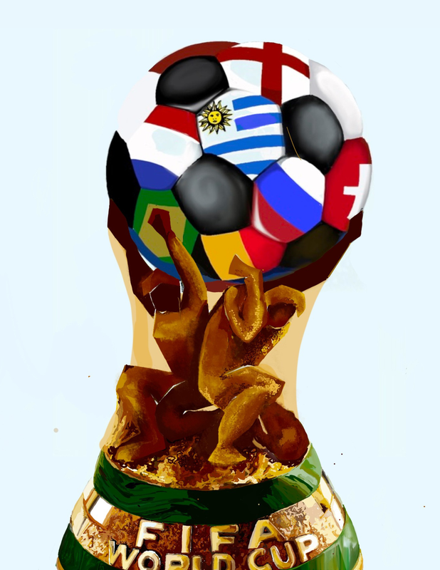
More Than Just a Game: Conflict and Contention Demonstrated by 2022 World Cup |
|
I created this design for an article on the online Spartan Shield using Procreate. More Than Just a Game: Conflict and Contention Demonstrated by 2022 World Cup centered around the controversy that ensued in the World Cup after Iranian players refused to sing their national anthem at a game in response to recent human rights issues in Iran. To represent this conflict, I created a version of the World Cup trophy; two players make up the stem of the trophy, struggling to hold up the weight of national tensions that are represented by the global soccer ball. I think that the most important part of this design is the stance and color of the two people. In the real World Cup trophy, the bright, golden stem shows people standing tall and proudly supporting the world; however, in my design, the people are tarnished and helplessly crouch down as the soccer ball starts to slip from their control.
|
|
